Friday 20 June 2014

Come Home to Me (Finnibair inspired)

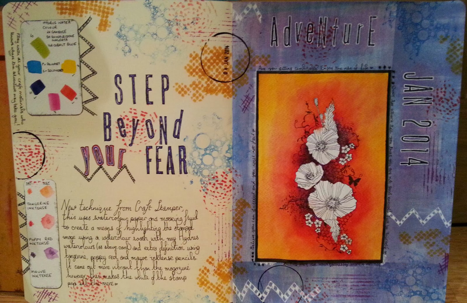
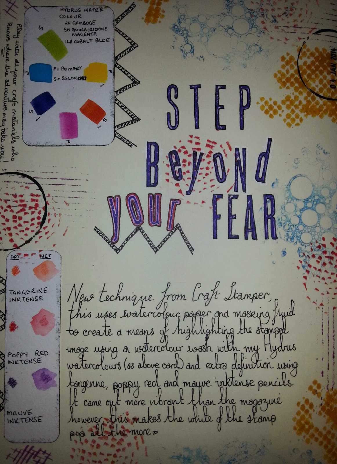
Hi hope you are all well.

So for some time I had a small double page spread started which kind of dried up for inspiration as can happen.

Today while struggling to acclimate to a hearing aid I thought I would try to distract myself from the incessant buzzing!

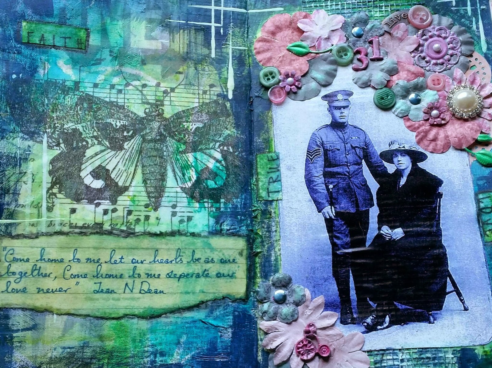
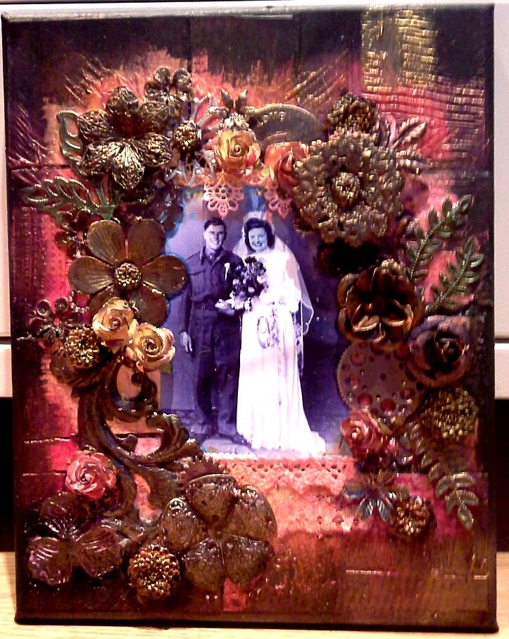
Following my recent posts I thought I would draw on my Finnibair course to inspire me and a vintage photo of my maternal great grandparents.

The base spread was made up of Tim Holtz paper and tissue paper torn and applied to the page.  Although I love the American street sign paper it didn't fit with what I wanted so I did a gesso wash to knock it back.

Next step was applying some colour using a floral template from Barbara Grey and turquoise and lime dylusion sprays. Again knocked back a little with my scrap paper.

Next I applied some Luminaire silks in the coordinating colors to add some shimmer.  I then applied a pink doily and a strip of adhesive decorative tape.

After adhering the photo I began to compose the embellishments and stuck them using heavy duty medium.

Once happy I painted all metal embellishments with gesso as I wanted to change their colour and accent them with mica Silks.

Once this was all completed to know the brightness back I used a dry brush technique with navy paint around the edges.

I stamped some words and coloured them with distress stain.

The poem suited what I wanted to say about those wishing for their loved ones to come back from war.

Hope you like the results as much as I do.

Saturday 14 June 2014

Finnibair Daydreamer

This was the second darker piece created in my Finnibair class at Art from the Heart based in Harrogate on 1st June 2014.

This used a photo of my maternal grandparents on their wedding day which I have adored since I first saw it as a child.

For this I chose the hidden garden technique.  First the canvas was covered in black gesso and then a patchwork of papers and the photo placed and applied.  Then using heavy gel medium and a catalyst tool patterns were applied to the surface.

I sprayed the lace and applied it beneath the photo before adding the metal, paper and plastic embellishments.

This time instead of painting over all the elemnts we just painted black those we wished to change.

Next we dry brushed primary element by Luminarte on the canvas to bring out the texture and applied silks paints to the black painted elements and areas we wanted accentuating.

I hope you love this as much as I do.

All products can be found at Art for the Heart www.afth.co.uk.

Santoro Journal page

This journal page uses a new stamp and new technique to create it.

This was created in 23rd April 2014 and was inspired by my childhood memories of growing upon near the norfolk coast and spending time there with my family and more recently holidays to the south coasts with my hubbie Ben and our dogs.

The background was taken from an issue of craft stamper magazin and involved three shades of distress inks (shades of lilac/purple).  The firststep was to swipe thepalest colour direct to paper vertically and horizontally.

The next stage involved a floral stencil and the mid shadebeing applied through it using cut and dry foam.  When thishasbeen done I then removed the stencil cleaned it, flipped it over and did the same process with the dark shade to complete the look.

I applied two coordinating mats in tworn distress paper from coordinations and stamped my sentiment.

The image was stamped and cut out using my cuttlebugand a spellbinders die which I then used to create the frame by blending with distress inkin stormy sky and a judikins peg stamp to add the stars and dots for texture.

The image was colouredusing promarkers from my stash and finally I used a wooden santoro key accent coloured with distress ink to complete the page.

I hope you like this.

Beautiful is something we should tell ourselves everyday!

This page was created in April 2014 and contains a background technique fromcraft stamper magazine using a brayer and distress stains.

First you apply the first colour of distress stain in this case red brick to your craft sheet and  roll thebrayer through it.   Roll it in smooth strokes horizontally down your page.  Dont worry if you get a spattered effect as this is what we want to achieve.  Remove and remaining ink from the craft sheet, clean the brayer and do with a second contrasting colour.  I also used this secondary colour to add splatters with the applicator.

To complete the pageI used some papers and imagery from Graphic45 Couture collection.  Crackle accents was added to the roses for texture and text added on the journal area.

I hope you like this.

Finnibair Overemotional

This was created and achieved with a morning class by Finnibair hosted at Art from the Heart based in Harrogate on 1st June 2014.

As you can see from the imagery this means alot to me as this is my great great mother on my maternal side.

This tall thin canvas was created initially with the placement of tge photograph and strips of ripped material to create the impressionof a body.

We then placed a number of metal, plastic and paper embellishments to the top of the image to create a kind of headress and to balance it out a couple of items placed on the body and to the bottom of the image.

To creatr additional feeling with a heatgun we applied hot glue to create texture and emotion.

The puece was tgen painted with gesso to create a ghostly effect protecting the photo and neutralising the colours of the elements applied.

Some stamping with archival ink and 6b pencil for shadow shade was applied. With a dry brush blue and lime Luminarte silks were added and spritzed with watet allowing drippage to flow down the piece again protecting the photo.

Overemotional a fantastic name for an appropriate piece full of technique and love.

I hope you like it too.  All products can be purchased through www.afth.co.uk.

Sunday 26 January 2014

Adventure

 
As part of my crafty challenge for 2014 is to instigate and try all the new techniques I have accumulated over the last twelve months from magazines into my projects and art journal pages in the forthcoming year.
 
 
To kick start this year with a bang, this technique comes from the February issue of Craft Stamper magazine and incorporated the Masking Fluid and Watercolour wash technique.
 
The main technique can be seen on the central floral image.


Thursday 23 January 2014

Tea Bag Paper Technique (from Art Journalling Magazine) Part 1

This was a technique that I sourced from the current Art Journalling magazing, it is truly awesome and upscales a normal every day piece of rubbish into a wonderful piece of vintage paper for card making, art journalling or mixed media.
 
To make the final piece of paper you will require around 20 used tea bags pressed flat after used and dried, this can be sped up slightly if you place them on top of a warm radiator.
 
Once you have the dried tea bags open one end and remove the dried tea leaves.


 Then cut open the two side seams and open to create a rectangle removing any lingering tea.

 
Place the first tea bag on to a non stick craft sheet (although the article did also suggest that wax paper would have the same effect as the craft sheet), overlap the second tea bag with the first and put a layer of soft gel medium over the top continue with the remaining 8 tea bags making the piece of paper the size you want.
 
 
Once you have done that repeat the step with a second layer of ten opened tea bags and allow to dry on the craft sheet.

Once the paper is dried (overnight is ideal) you can ease one corner of the paper away from the craft sheet and gentley remove it ready for use.

Any dried gel medium is easy to remove from the mat so dont worry if you have patches on your craft sheet.

You are now ready to use your finished paper which will look similar to this:


I was very impressed with this technique, admittedly it would take quite a few tea bags to make a larger piece of paper but this made about one side of a small dylusions journal.

I will post shortly the page I have made using this textural paper.

I hope you liked the technique.

Friday 10 January 2014

Secret Garden


I have had a love of Graphic 45 paper collections for some time but was concerned that I could not create anything that would give them justice and beauty.

This year I have grasped a challenge to start to use these and other papers I have purchased and as part of my small Dylusions Journal have begun to do a technique inspired through Art Journalling Magazing of a gluebook, although I do not use it soley for this purpose this is my first page using the secret garden paper pack which were built upon and distressed using portfolio crayons.

It is my first endevour and my paper skills are a little rusty but for a first attempt I was happy with the result.

I hope you enjoy this page.

Wednesday 8 January 2014

The only place from which to begin


So as often happens to us throughout life we can feel somewhat delicate, retrospective and wishing that life had taken us down a somewhat happier path than we believe to be on at this time.

My dream has always been to travel however, life took me down the home owner route and now financially it is not always possible to travel as extensively as maybe I could off in my younger years.

I love this journal page in my small Dylusions Journal depicting the air hostess many of you will recognise from Tim Holtz kraft resist papers.

I colourised this using a colour I rarely draw on Seedless Preserves and one of my favourites Salty Ocean.  Then I wanted to try my new pearlescent inks which I had in a purple shade to create some drippage.

I also wanted to create a neutral background in titan buff acrylic paint and the Seedless Preserves distress ink to sit my handmade tag pocket.  The tag was colour tinted and stamped and then I wrote my journalling on it.

I hope you like this page, it is quite plain and simple but there is something about that simplicity which I like and I have gained this by expanding my colour range I use and introducing new techniques and products.

Monday 6 January 2014

Play


So like many aspiring crafters and mixed media devotees, I often draw inspiration from some amazing artists on Youtube for inspiration. 

Leslie Crawford originally introduced me to a love of art journalling, but I am continually blown away by the quirky stylings of Dyan Reavley and so this page was spawned from two things.

1. Using Black Gesso as a background

2. Dyan Reaveley's video on the web showing how she does a coloured background containing zentangle type doodles and then masking it off and covering with the aforementioned Gesso.

As you can see from the photo the video inspired a page which reminds me not only to be adventurous in trying new techniques but also that new techniques can develop an amazing layout for your journal.

Playing with this technique also drew me to use my metallic sennelier oil pastels which were ideal against the dark black background and a handmade journal tag.

I hope you like this page in my small Dylusions Journal.

Saturday 4 January 2014

Lady in Red

 
This is a wooden block I created for my colleague at work (dimensions 15cmx10cm) which I purchased at Stamp Addicts. 
 
This block was primed with gesso and then a layer of burnt umber applied to the wood as a base layer.
 
I then proceeded to apply the Tim Holtz paper with US Street Names on it to the block after distressing the edges with a distress tool and applied some red acrylic paint to the edges and to accent some of the paper.
 
I then adhered the 50's women to the block using the gesso paper transfer technique and gently rubbed off the reverse side of the paper to reveal the image.
 
Finally to complete this item I distressed areas of the image to tie her in to the background using faber castell pitt pens.


Thursday 2 January 2014

Little birdhouse in my soul


Well 2014 is upon us and I am endevouring to keep more on top of my blog posts this year.
 
Above is a picture of a wooden block I created towards the end of last year with Lesley Crawford using a wooden block (15cmx10cm).
 
I first primed the wood with gesso and then decorated the base layer using a pale blue acrylic paint and honeycomb, stars and punchenella stencils with white, teal and cerise acrylic paint, rubber stamped some text in black archival and blue archival arrows.  Remembering to do the sides and the reverse of the block.
 
 
This was then overlayed with the image of the birdhouses and birds taken from a napkin and the areas required cut out of the napkin and additional layers of tissue removed.  I then used Mod Podge in the areas I wanted to stick the napkin and then applied a further layer over the top to assist in getting rid of any air bubbles and to seal it to the block.